Year
2024
Upsell UXR
How important is iconography when upselling subscribers?
Year
2024
Role
Lead Designer
Target Platform
10-foot UI, Mobile, Web
Design Process
Research
dScout testing
Presentation
Challenge
Many Disney+ subscribers were unaware that certain ESPN+ titles required an upgraded plan. The existing upsell prompt, while present, did not sufficiently signal restricted content. Users expected content to play, leading to negative sentiment and missed revenue.
Primary pain points identified:
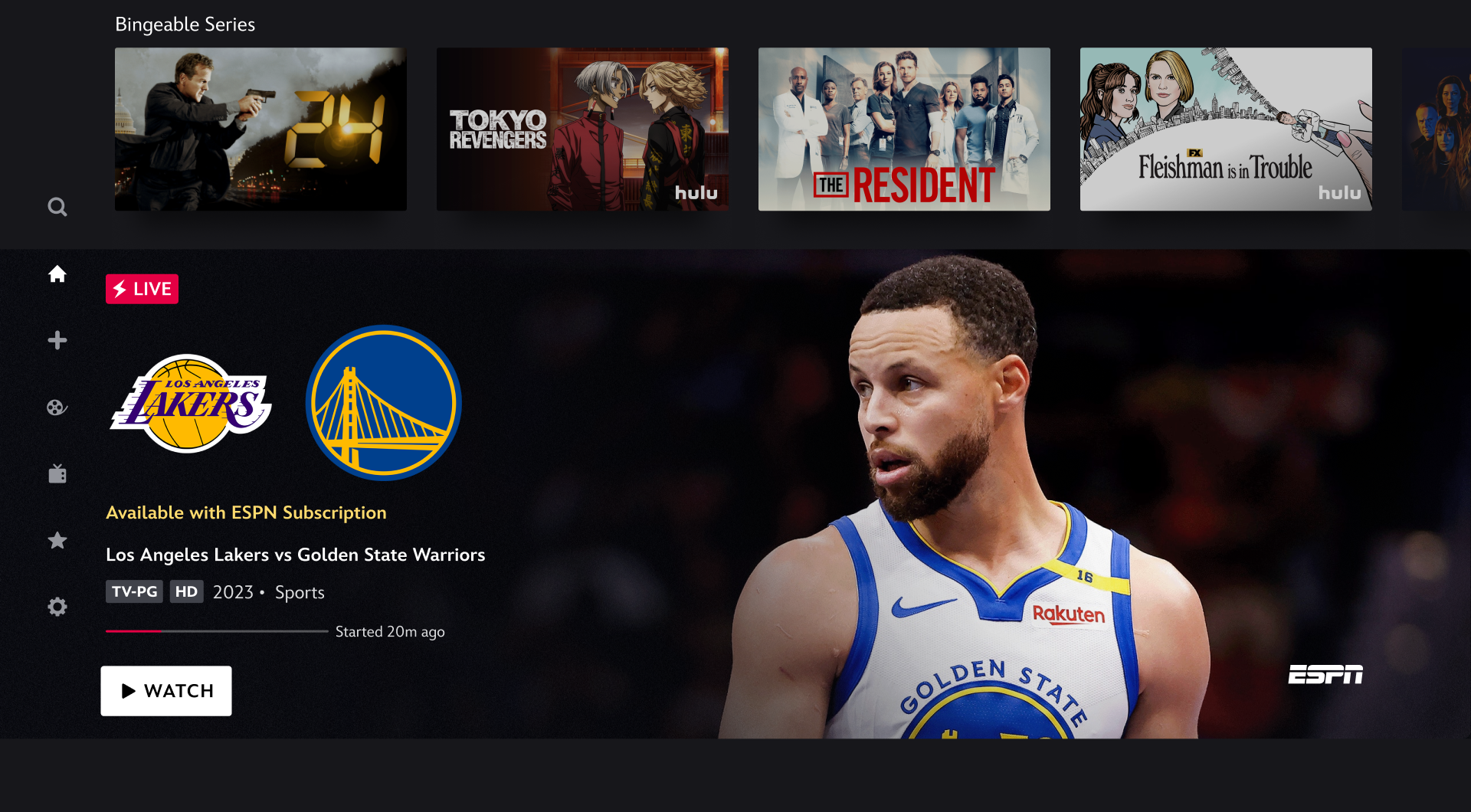
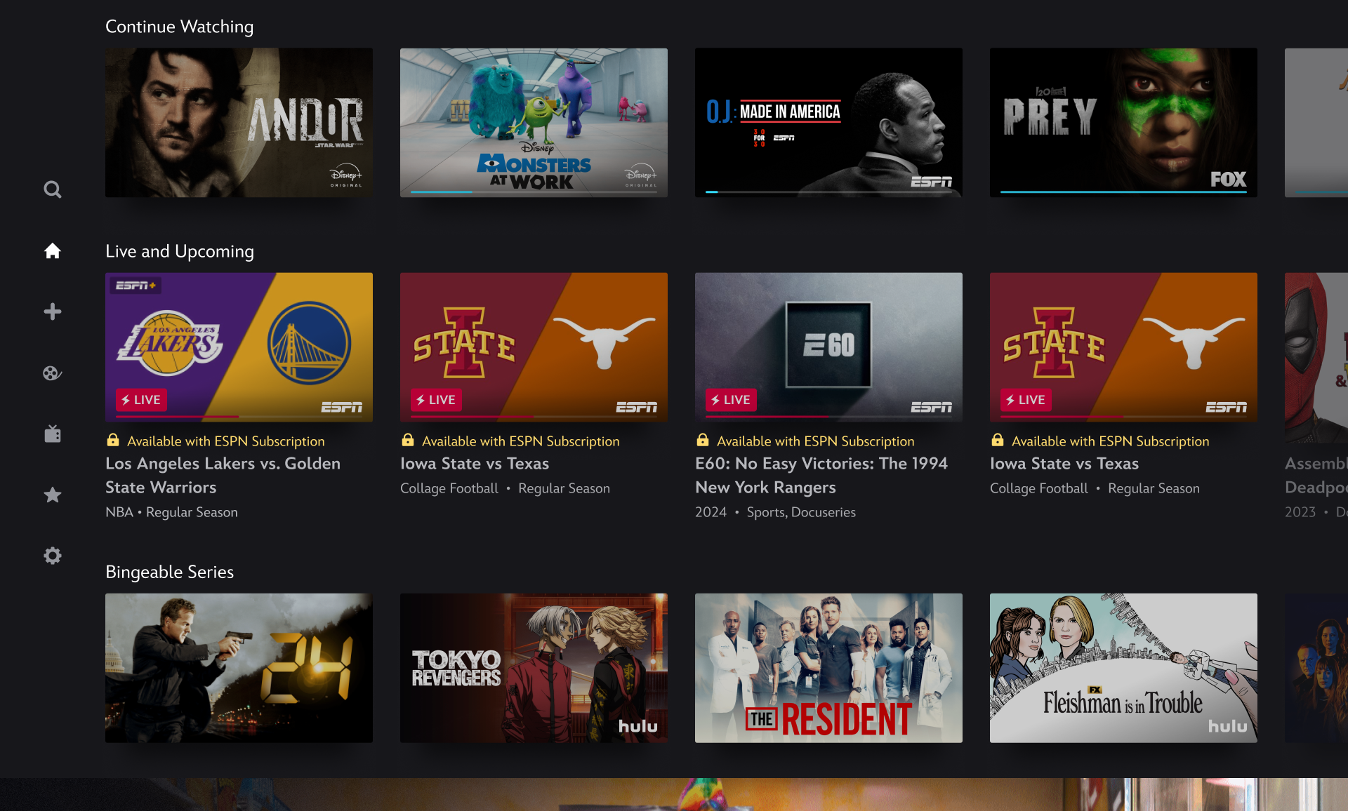
ESPN+ content appeared unlocked because thumbnails looked identical to accessible content.
Users clicked content expecting it to play, only to be met with an unexpected paywall.
Upsell prompts were easy to overlook, resulting in confusion and churn risk.
2. Hypothesis
Adding a lock icon alongside existing upsell messaging would:
Increase user awareness that content is restricted
Prevent mis-clicks and frustration
Improve clarity and transparency
Enhance likelihood of users upgrading their subscription
I believed the lock icon could serve as an immediate and universal signal for “content not available,” reducing ambiguity.
Research
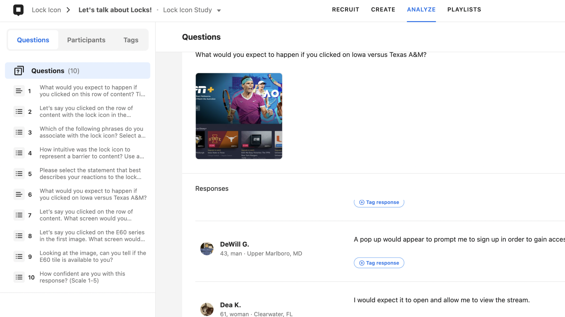
A moderated concept test was conducted using dScout and a browser prototype.
10 participants, ages 20–65
15–30 minute structured sessions
Tested 1 upsell flow with 4 post-click screen variations
Evaluated both pre-click interpretation and post-click expectations
Key Questions
Do users understand the meaning of the lock icon?
Does it change their expectation of what will happen next?
Does the experience feel intuitive?
Are users less likely to expect content playback?
4. Competitive Analysis
The team reviewed lock icon usage across streaming, fitness, and shopping apps, including Peacock, Prime Video, ClassPass, MLB, and wellness applications.
Insights showed:
Many platforms use the lock as a badge-style indicator
Some pair it with labels or prompts for clarity
Icons alone are ambiguous without context
This aligned with industry guidance: icons must be paired with text to avoid misinterpretation.
Result
1. Users understood the lock icon as a barrier to content
Most participants associated the lock with:
“Barrier to content”
“Behind a paywall”
2. The lock icon improved clarity but needed stronger pairing
Users said the icon clarified the upsell, but only when paired with text.
A lock alone was not strong enough to fully shift expectations.
3. Users expected a plan change screen, not an immediate paywall
When clicking locked content, participants anticipated:
A clear message
An explanation of available plans
Pricing breakdowns
A guided path to upgrade
Sudden paywalls felt abrupt compared to their expectations.
Takeaways
Based on qualitative insights, I proposed three design updates:
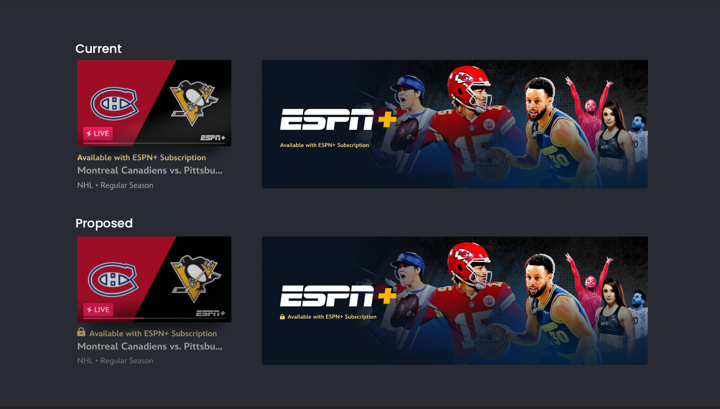
1. Pair the Lock Icon With Existing Upsell Prompt
Maintain current messaging but add the icon for immediate recognition.
2. Integrate Lock Icon and Prompt Into the CTA
Embedding the icon directly inside the call-to-action creates a stronger, unified signal and reduces ambiguity.
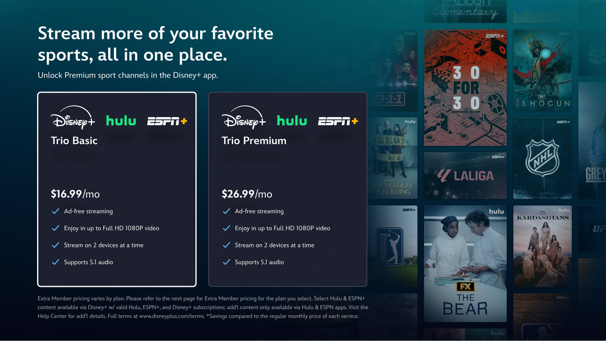
3. Adopt the Multi-Plan Interstitial
A redesigned interstitial offering clear plan info will:
Better match user expectations
Improve transparency
Reduce frustration and bounce
Provide a more guided upgrade path
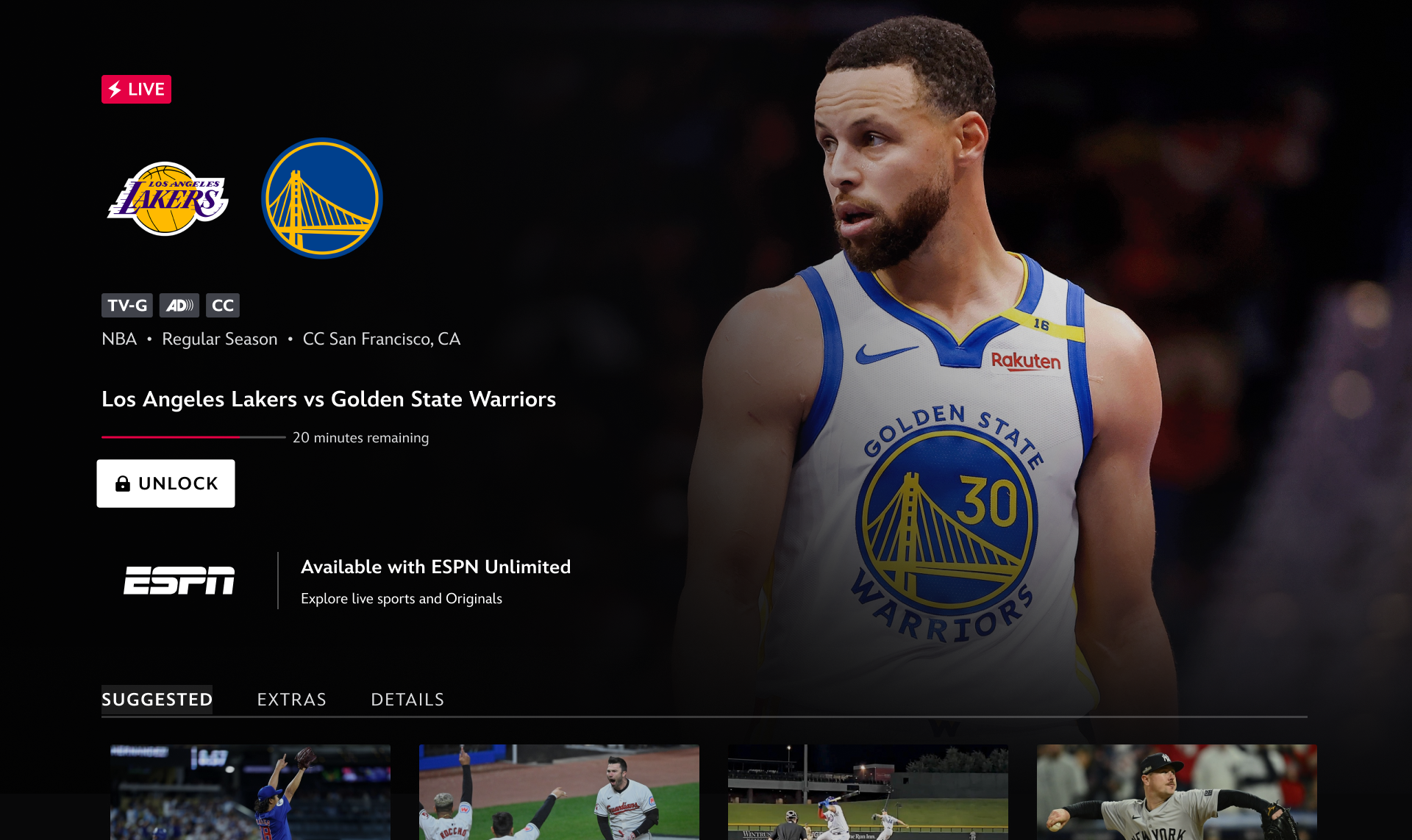
“It [upsell prompt] needs to be larger or have a lock on it or else people would get upset thinking they could watch”
— Ellie H. (User testing)